project insights
solo school project

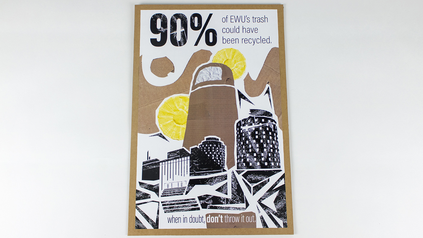
This poster had a simple objective: create a poster that will help increase recycling on campus. There are many ways to do this and many organizations have tried to promote similar goals in the past. However, in many situations people either fail to absorb the information present on the poster or don’t view it at all. I wanted to create something that was somewhat eye catching and specific to EWU’s campus, which is why its most identifiable buildings are present in the poster’s illustration. The imagery was textured with recyclable objects (yes, I did recycle them after scanning them) such as cardboard, napkins, and wax cups. This gives the poster a unique visual aesthetic while also tying it back to the poster’s subject matter.

The tag line “when in doubt, don’t throw it out” is easier to recall them statistics or information on what exactly is recyclable and what is not. As it turns out, recycling is quite complicated. My goal was to prompt people to put their objects in the recycle bin when they aren’t sure if it can be recycled because EWU’s recycling center sorts what they receive; worse case scenario the items get thrown out by the staff. This poster went through three major iterations and illustration styles before I finally settled on the industrial-influenced one you see here. Coming up with a style that was different from the campus' normal printed materials was the most challenging part of the project.

Thanks for reading.

— Justice / justicedsn@gmail.com