Create a location-neutral website for Forward, formly known as The Lab.
target audience
Forward's clientele is broad, but they primarily target individuals
who don't know where to start with fitness and exercise. They help
people set and reach fitness goals through coaching and group
exercise.
audience needs
The website acts as a sort of the sales pitch to the visitor and
drives them to submit a request via the detailed contact form. It
informs the visitors about all of the training options available and
provides information on when the group exercise classes occur.
deliverables
A responsive website that drives people to start the sign-up
process.
project insights my role: web designer
This project provided a unique set of challenges the whole way through.
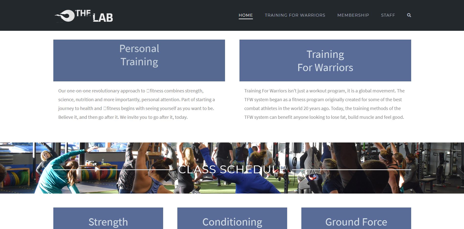
When the client came to us, their website had been slowly falling apart
for quite some time. Content and functionality had been slowly falling
away as things broke as a direct result of neglect. My job was to remedy
this situation while also updating the look and feel of their online
presence to match the updated identity they planned on rolling out in
early 2020.
The old homepage of The Lab.
In addition, The Lab's old website wasn't servicing all of their needs;
visitors who submitted a contact request weren't given the opportunity to
submit information that could have greatly streamlined the sign up
process. To remedy these two issues, I worked with the client to create
a set of questions for visitors to the site in order to create a form
that would service their needs better. We came up with roughly 20
questions, which I then filtered down to what I saw as the most
important to their process. I then tailored the information presented on
the homepage to prepare visitors for the form.
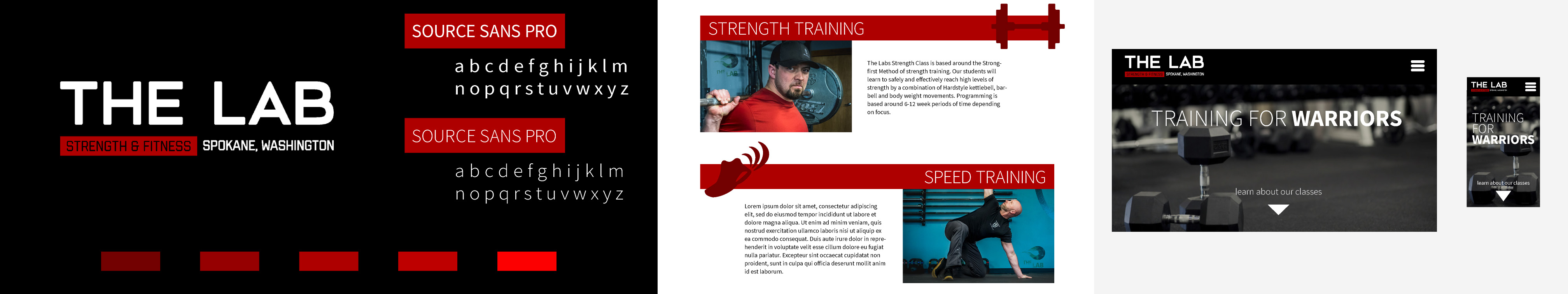
With the necessary information established, I worked with a copywriter
to create more detailed text content for the website and created a set
of custom icons to match, along with a stylescape to set the visual mood
for the website. The icons used on the stylescape weren't necessarily
intended to be used within the final product, but rather to express the
style that would be used.
The Lab's Original Stylescape.
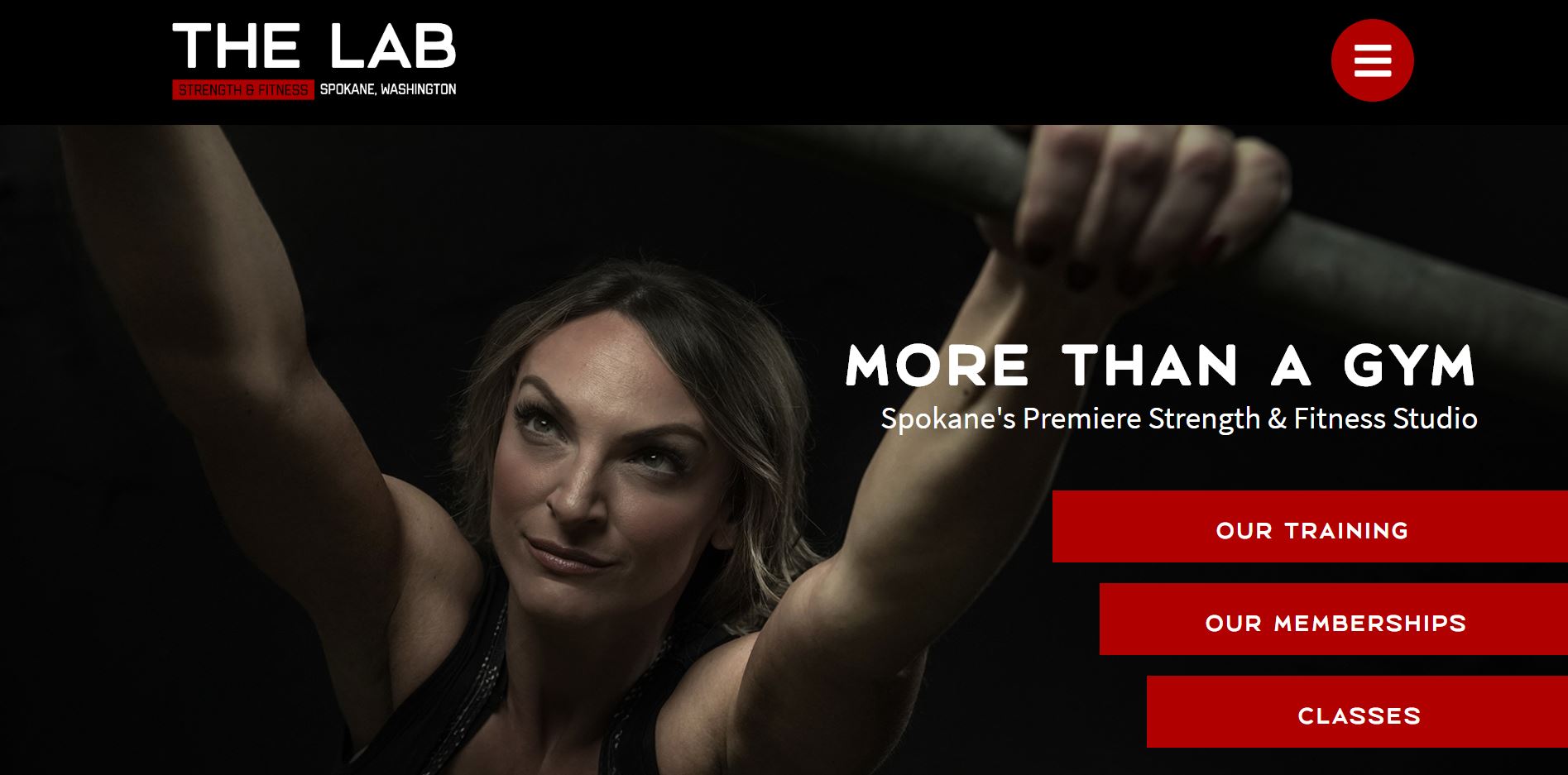
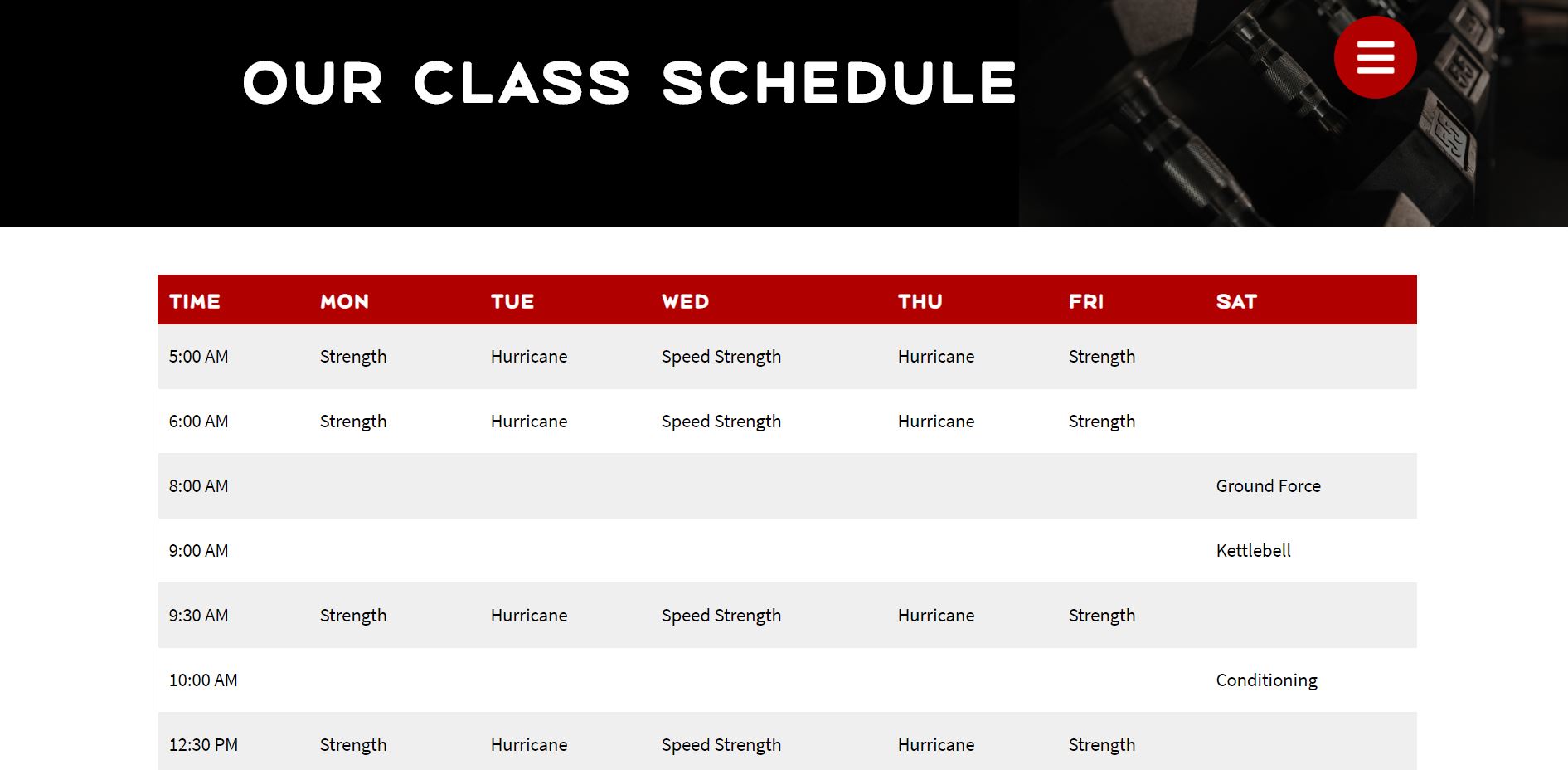
With a clear direction established and OK'd by the client, I started
building. The most challenge portion of the website was the calendar
page- a page that sounds relatively simple on paper. The challenge came
with finding a way to make the page responsive on mobile devices. In the
context of a desktop or tablet viewport, presenting a gridded calendar
is simple. However, this type of presentation doesn't scale down to a
mobile device in a satisfying or functional way.
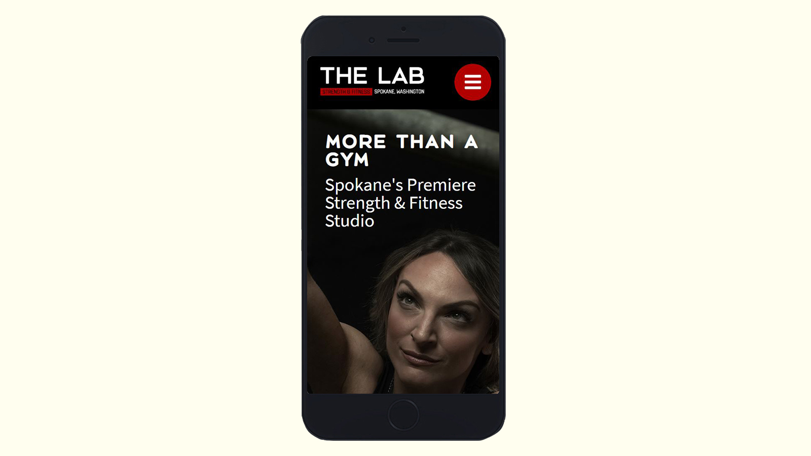
The Lab's Class Schedule Page on Desktop.
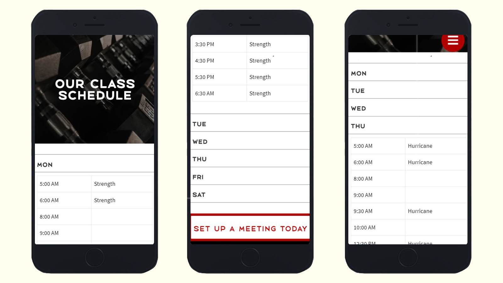
My solution was to break each individual column of the table into a drop
down menu. This allows me to fit all of the information onto the page in
a way that is easy to read and navigate on the single column layout that
mobile devices allow. This makes it simple for a visitor to select the
day they want to see and view its class schedule.
The Lab's Class Schedule Page on Mobile.
Overall, this project was successful in restoring the functionality of
The Lab's website and helped decrease their site's bounce rate and
increase user engagement significantly. It also provided me with an
opportunity to experiment with UI patterns that I typically don't engage
with and expand my boundaries as a designer and problem solver.