Introduce music listeners to noise music while also developing my
lettering and typography skills.
target audience
Music nerds, musicians, artists of all varieties, those interested
in avant-garde art and expressionism.
audience needs
Informative writing with a clear structure, humor, and engaging
visuals.
deliverables
Printed and perfect bound short book, printed a minimal cost to make
the book more accessible to a variety of people.
insights
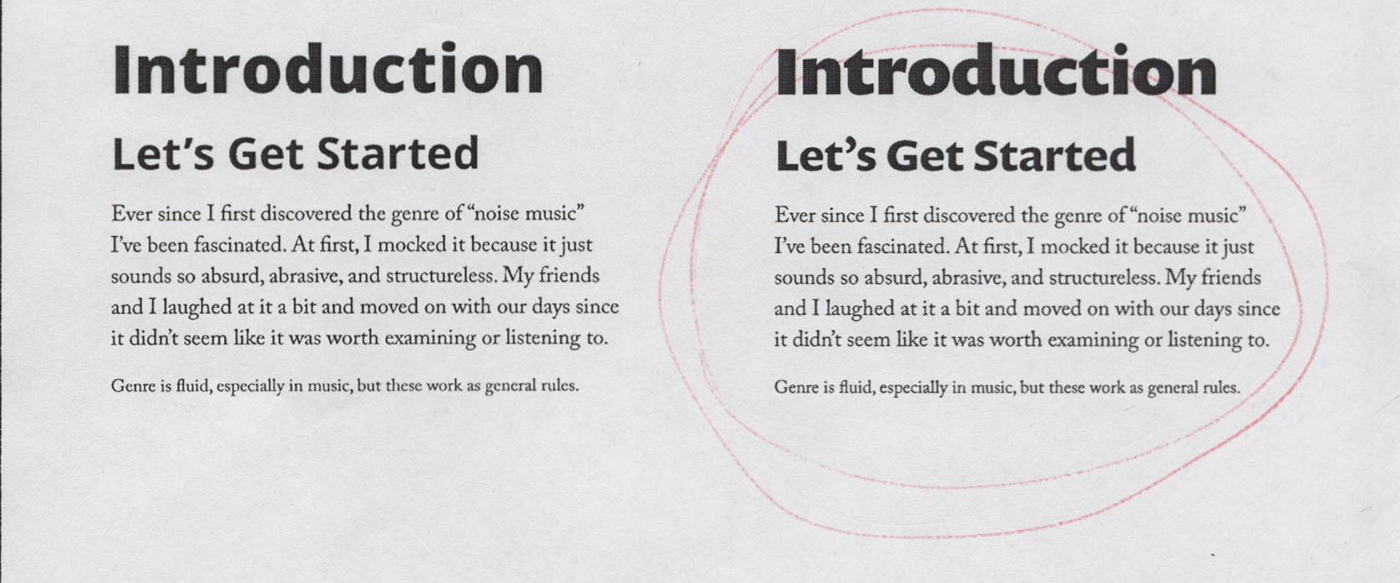
The primary objective of this project is to introduce music
listeners to an abrasive and challenging form of music using a
visually dynamic and short book. Writing the content was one of the
biggest challenges presented in this project, but the intimacy that
this process created helped me understand how to design and present
the material better. I wanted to maintain some level of consistency
throughout the entire book while finding ways to surprise the reader
upon every page turn.
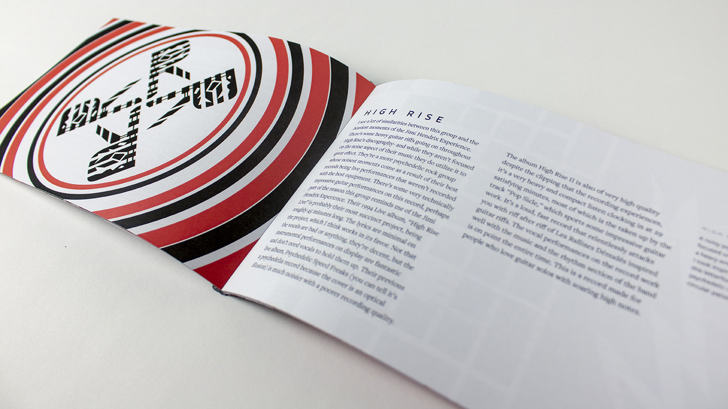
Each letter went through several dozen sketches as
well as numerous defined drafts and digital iterations. The order of
the book (and therefore the lettering) was decided by the general
accessibility of each artist, from easiest to the most challenging.
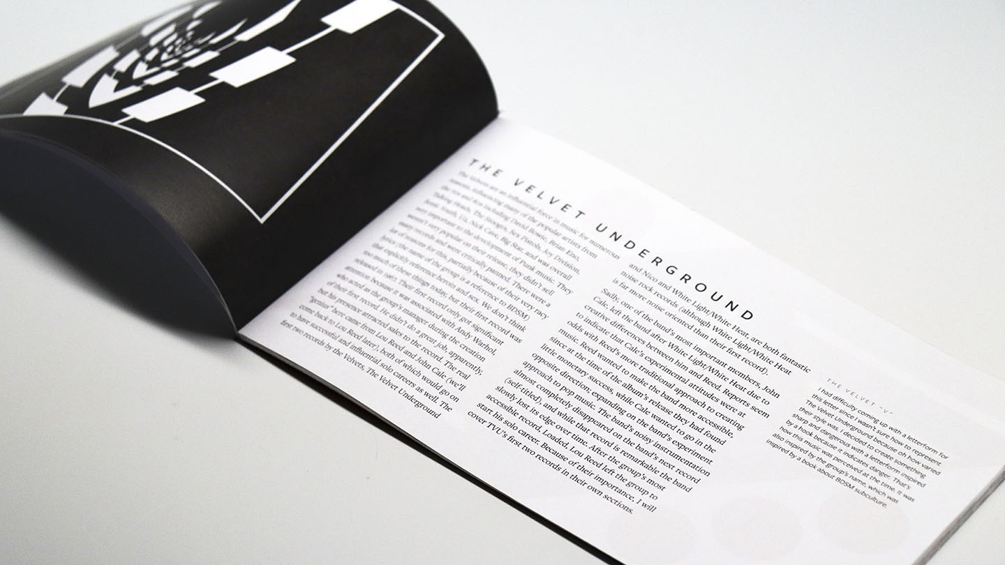
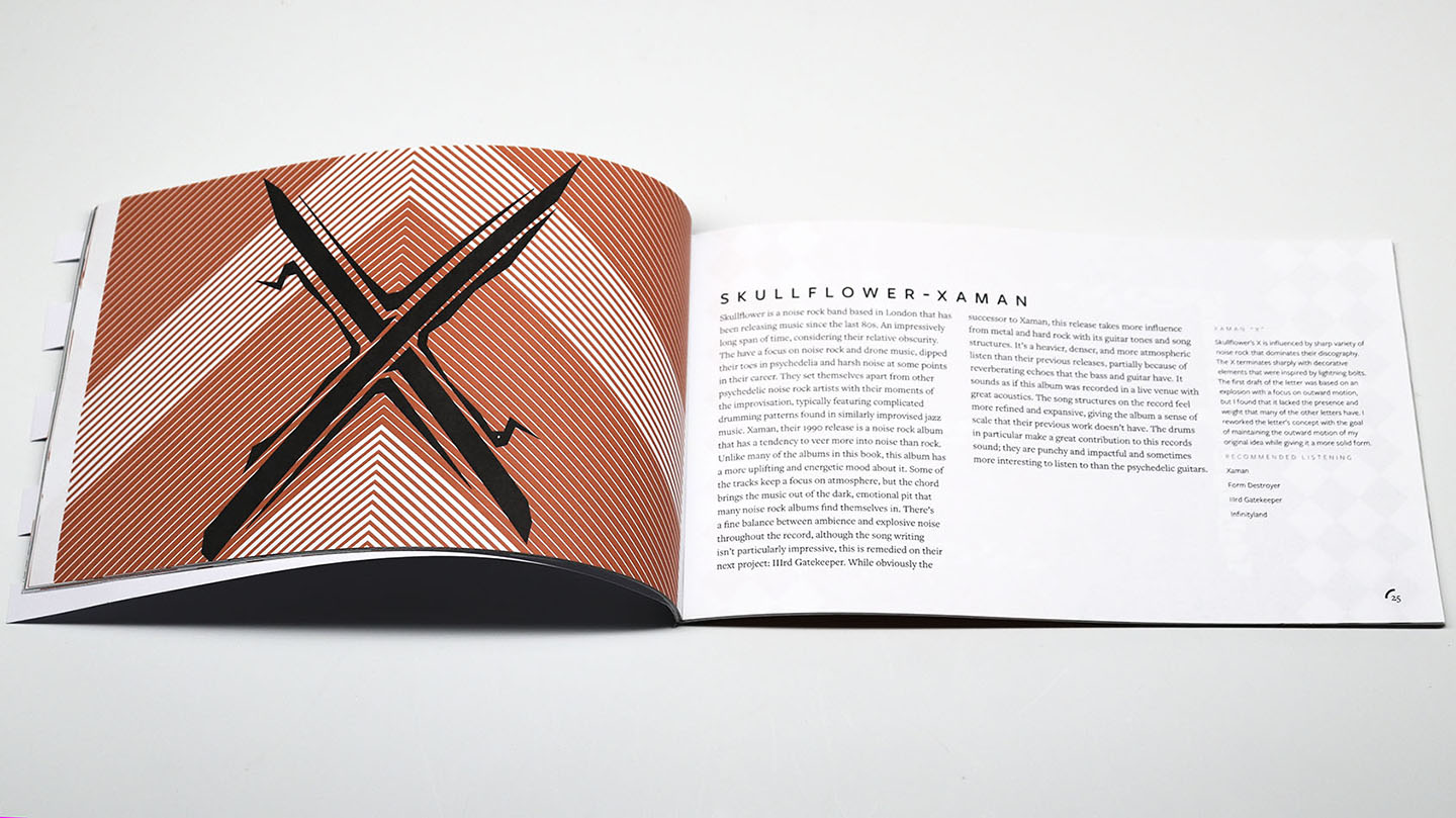
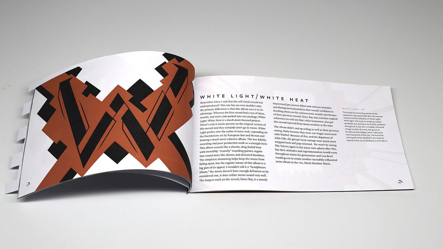
Each letter was designed to reflect the artist or album it
represents in some way, sometimes through linework and sometimes
through general shape.
extended process case study hobby project
This is one of my favorite projects to have worked on due to the freedom
provided by the book’s subject matter: the experimental and strange
genre of noise music. Before we begin, I must explain why I thought such
a book was necessary in the first place. There already exist writings on
noise music by people more qualified to discuss the subject than me
(people with actual music degrees), but all of them already assume some
level of familiarity with the subject. Most people are not aware of the
history of the Futurist movement of the early 20th century, and it is
assumed by these works that the reader understands that importance of
Merzbow to the worldwide and Japanese music underground, and they assume
that the reader will understand the motivations behind musicians who
work in the genre. Most people are not familiar with what noise music
is, and they will most certainly not be aware of the genre’s subtleties.
What I wanted to do was help people gain a general, surface level
understanding of the material so that they might continue to engage with
the subject through more detailed books or on their own.
When I set out to create this book, I wasn’t sure of how I was going to
approach it. I set a few basic goals to keep in mind as I worked on the
project: keep the book accessible and use it as a delivery vehicle for
the book’s content. Because of the subject matter, it was easy to steer
in a direction that obfuscated the text of the book, but I wanted it to
act as a legitimate introduction to noise music. However, I also wanted
to use the opportunity to do some more extreme visuals as well. I knew
from the outset that it was going to be important to strike a balance
between these two things. I also wanted to keep it cheap and simple to
produce so that it would be more easily distributed, were it ever to
enter such a situation. For this reason, I knew before I even started
researching the book’s content that I was going to use the “perfect
bind” method to bind the book, as it relatively cheap while still
serving my goals and budget appropriately.
I started my process by researching noise music, which I already had
some familiarity with, and this required a great deal of exploration and
music listening. My research process was a little different than my
normal approach because of how abstract music really is. I did research
things using the internet and read some books on the topic to more
deeply familiarize myself with it, but I also took time to listen to
noise music in a focused manner. My “notes” for this were not only my
general thoughts on the albums I was listening to, but also some
intuitive sketching so that I could attempt to capture the “visual mood”
of what I was hearing for future reference. I knew that I wanted to
begin the book with more accessible explorations of the genre, so I
started making a list that indexed the book from beginning to end. After
creating this list, I asked peers about their interest (or lack thereof)
in the subject matter and found they wanted less accessibility and more
of the “weird stuff” so I made some changes to my list and then began
the writing process. All the content in the book was written and
reviewed by me.
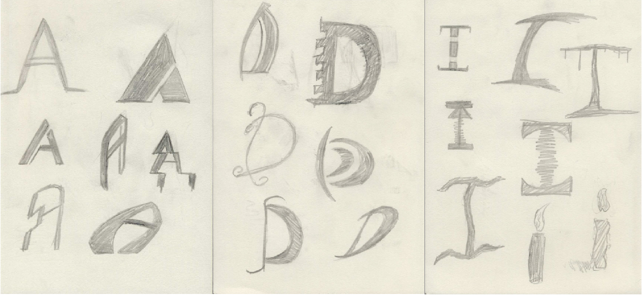
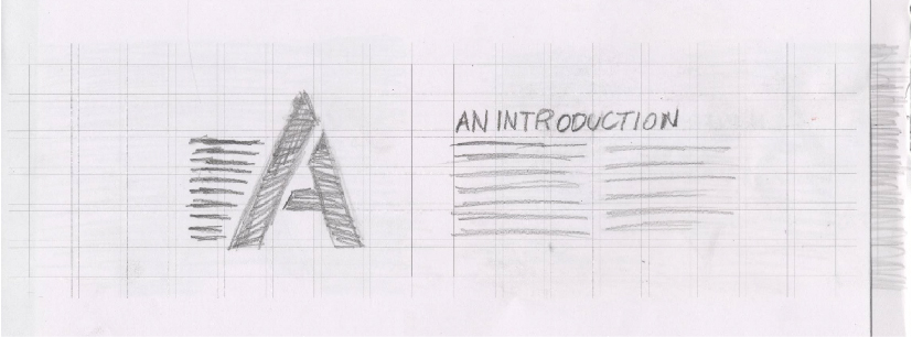
Sketch examples of A, D, and I
The original concept of the book was “the ABCs of noise music,” so when
it came time to create the visuals, I started off creating 10-20
sketches of each letter of the alphabet as well as ampersand. I then
analyzed the sketches and found the ones had ideas that I could develop
further. Once I found some core ideas for each letter I moved on to
another round of sketching before creating more “true-to-size”
representations of the letterforms on gridded sketch vellum; this was so
I could size each letter be at a point size of 216 (3 inches). Once I
was happy with the vellum comps, I scanned them and recreated them
digitally in Adobe Illustrator. My work on the letterforms was digital
from this point onwards.
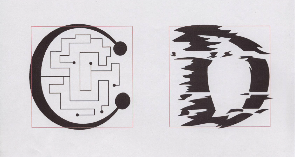
Digital comps of C and D
To get a better idea of how I was developing the letters, let’s follow
the process that created the letter I, which was for Sonic Youth. This
is located near the beginning of the book because of their general
accessibility. I sketched some ideas related to their different albums.
Some of my sketches were darker and aiming towards “creepy,” referencing
to one of their first albums: Bad Moon Rising. However, the sketch I was
most drawn to was instead a direct reference to their most successful
album, Daydream Nation, which has an album cover that is just an image
of a candle paired with some typography. I didn’t want to completely
replicate the candle on the album cover. Not only would that be a little
boring, it wouldn’t be very original either. After developing my first
digital comp I liked the idea that had formed but needed to redraw it
for more clarity.
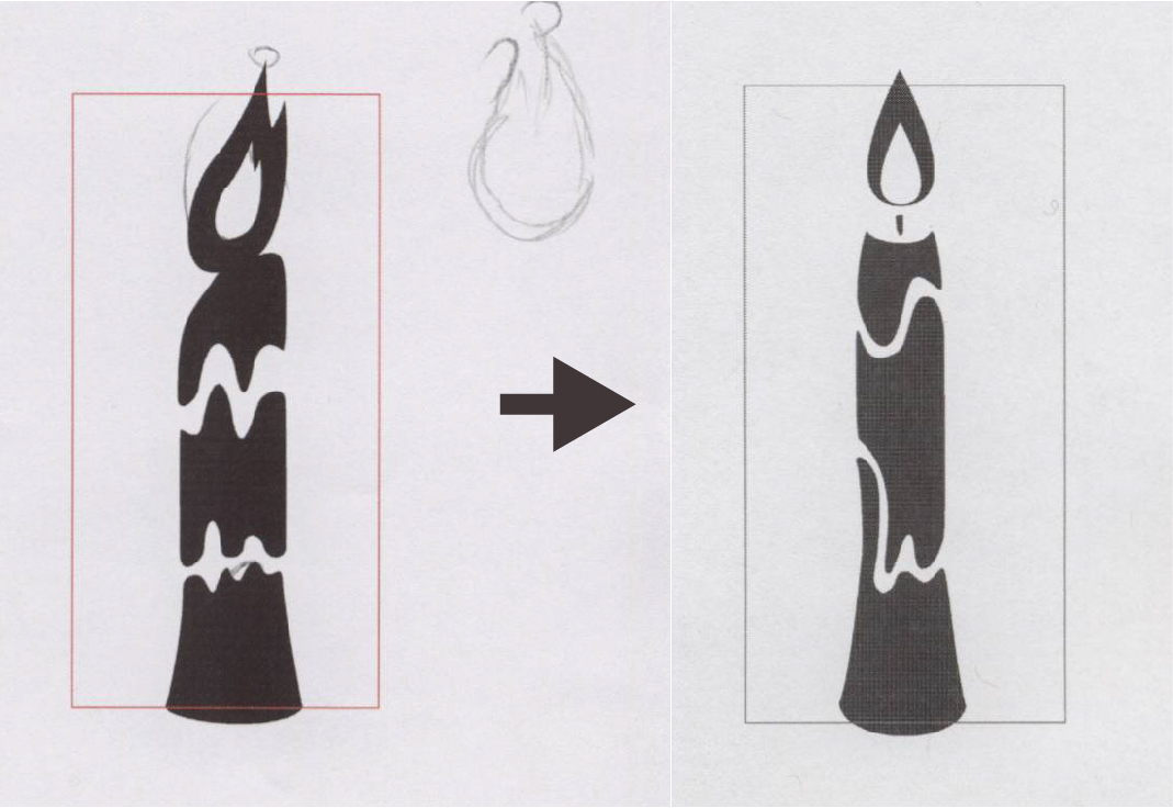
Letter I Digital Iteration Progression
The second digital iteration thinned out the candle and streamlined the
“wax lines” I had drawn on the original to make them more organic and
less like sound waves, which was fitting but not intentional. I also
redrew the flame to make it more realistic and “peaceful” instead than
the first version’s heavily abstracted and cartoony flame. When it came
time to create the graphic that would be paired with the letterform, I
placed circles over each other in order to create an abstract background
for the candle to rest over. This felt incomplete, so I added circles
around it that appeared to “pulsing” in order to give the image some
"movement" that guides the viewer’s eyes around the page.
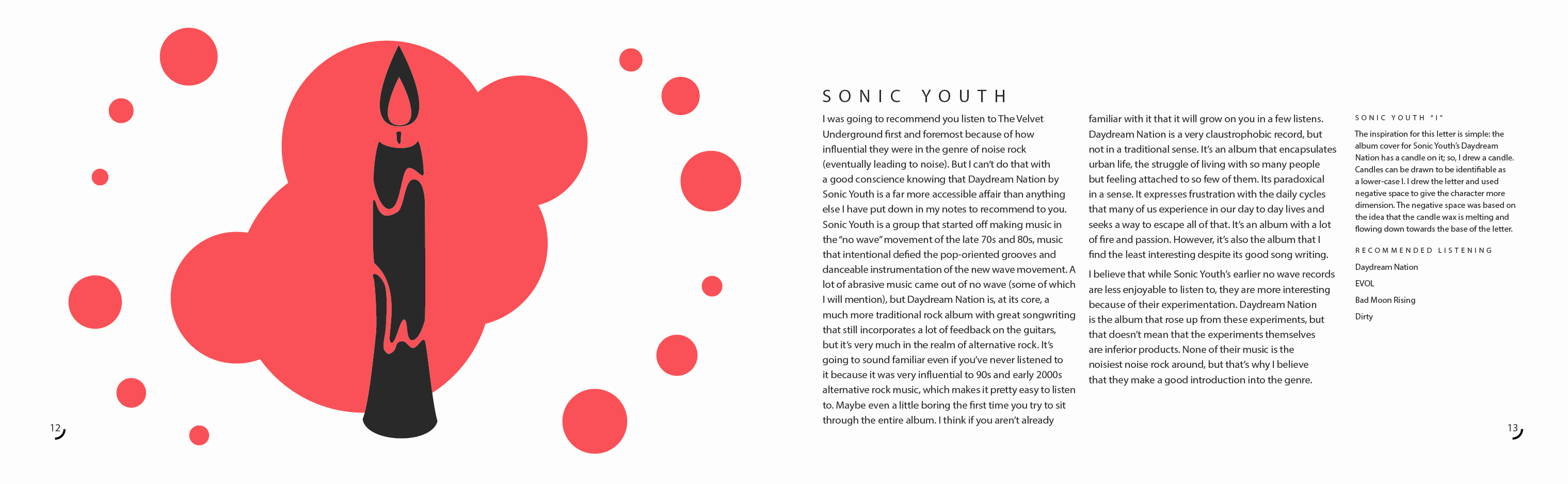
Letter I Final Spread
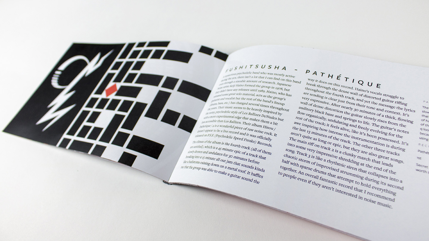
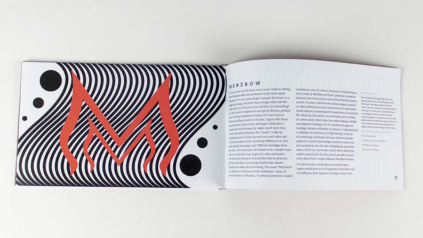
I adjusted the contrast, width, and stress of the letterforms when
applicable and added purely decorative elements when it was appropriate.
The overall style of each letterform is vastly different as they are
each modeled around the album or artist they represent. These visual
representations were based on my visual notes. This adds a level of
intrigue and visual appeal to the book because each spread has a
stylistically different graphic. I counteracted this decision by
limiting my color palette to 95% gray and a light red so that the book
would still have some form of visual consistency. I chose red because it
is a color that is associated with many types of passion, which fits the
subject matter well due to the strong alienating emotions that so many
of the artists I was writing about put into their music, more so than in
most other genres. Once I had completed the letterforms, I moved on to
developing a layout for the book.
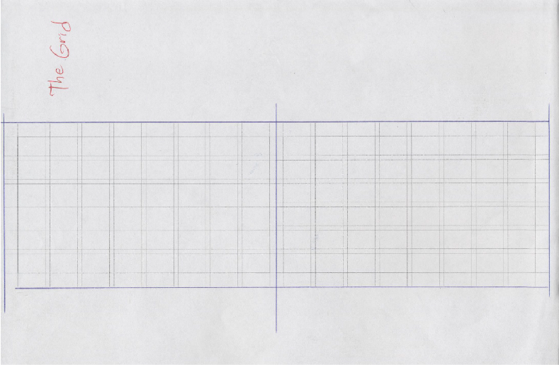
Printed layout grid
One of my several type specification sheets
Physical layout Sketch
I created a flexible modular grid for each spread and then printed it so
that I could sketch over top of it. I played with various different
positions and sizes for both the letterforms as well as the type, slowly
developing the layout. Once I had a general set of ideas that I liked I
started creating digital prototypes of them. At this time, I also
developed a set of type spec sheets to help me find strong font
combinations that I could use. I received some feedback from peers once
I developed these prototype spreads and then adjusted them before
re-printing them and seeking more feedback. I eventually found that the
most successful ideas I had developed were spreads that incorporated
unique graphics around the letterforms
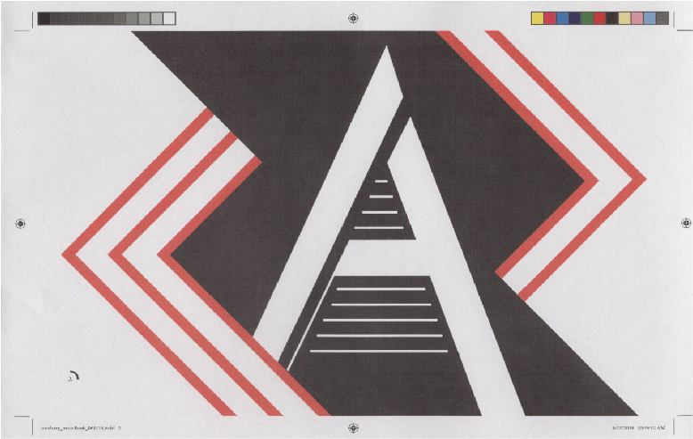
Digital layout iteration for Letter A
I decided to create one of these expressive graphics for each
letterform, which was quite a bit of additional work. There was little
sketching done for these graphics, instead I chose to create multiple
digital versions in order to work with my heavily distorted typography
settings more easily. It was hard to represent the “noisy type” on
paper. At this point, I refined some of the letters to fit the page
graphic that I had developed for them. This wasn’t always necessary, but
it helped some of the letters feel a lot more natural and cohesive on
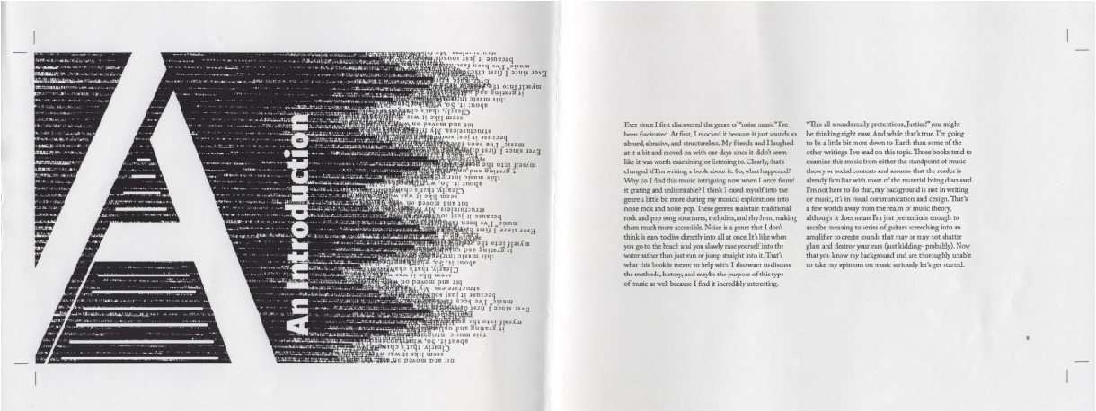
their pages. The letter A (at the start of the book) is an example of a
letter being modified to fit its graphic. On its page, I extended the
legs of the letter A to the edge of the page so that they appear to be
flowing off it. Once the spreads were complete, I created a simple table
of contents and a book cover and then got to work producing the book. I
printed the pages and then cut the “inner” edge, applied PVA glue and
book binding cloth, and applied the cover print to the bound spreads.
Letter A graphic test print
Looking back on the project after its completion I was relatively happy
with it. However, I disliked the final outcomes of some of the
letterforms (M, N, Z, R, U, Y, &). As a result, I later returned to the
project and reworked those characters and some of their page graphics. I
learned a lot during the project about lettering, typography, and book
binding. The lettering aspect of the project helped me get a better
grasp on the intricacies of type and how I should go about utilizing
hand lettering in my future projects. The reception of the project has
been good; the unique subject matter of the book really draws in
people’s attention and gives them numerous varied parts of the genre to
explore, ranging from noise rock to harsh noise. The graphics have
helped keep readers engaged with the book, at least during my
observations.