Overhaul Manito Park’s visual identity through an identity standards guide and destination poster.
target audience
Young adults, students, photographers, artists ,and people who are new to the Spokane area. Manito stakeholders.
audience needs
Appealing promotional material, strong color palette, and history and information that engages them so that they eventually visit the park. Park needs guide for utilizing the new resources, consistency, and help implementing the new identity.
deliverables
Logomarks, identity standards guide, and a destination poster for the park.
insights
Manito Park’s previous visual identity was unclear and lacked a distinct direction. This new identity is intended to create a more artistic and stylish feeling through the use of organic lines, hand drawn art, and vibrant colors. This needed to
be done while also communicating the historical importance of the park to the Spokane area. The printed materials were created with the budget of Spokane Parks and Recreation in mind, as a result all of the materials can be printed on tabloid
size (11” x 17”) paper or smaller. The illustrations were intended to appeal to a young adult audience new to the area becuase I found that those who grew up and around Spokane already had some kind of connection with the park.
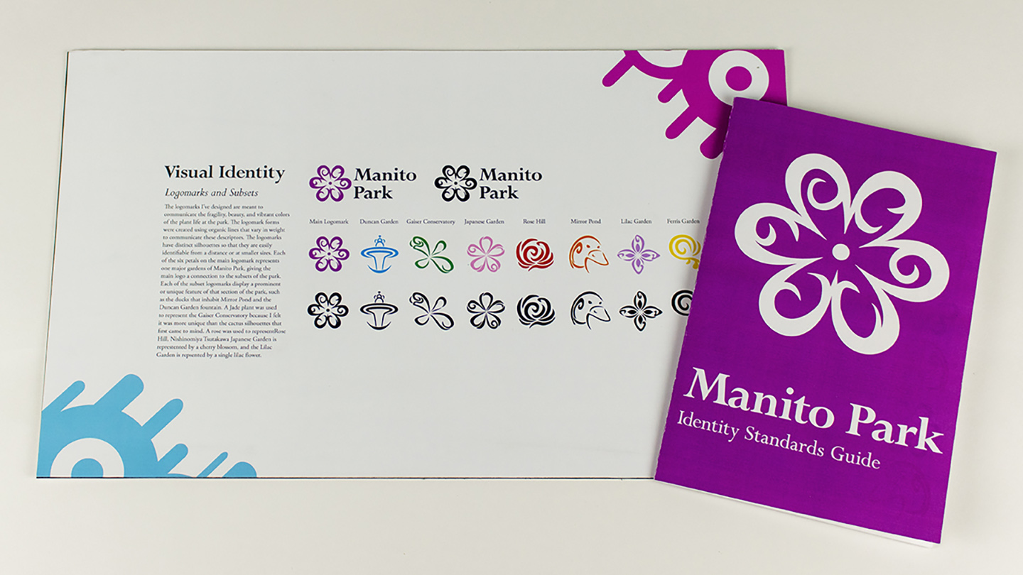
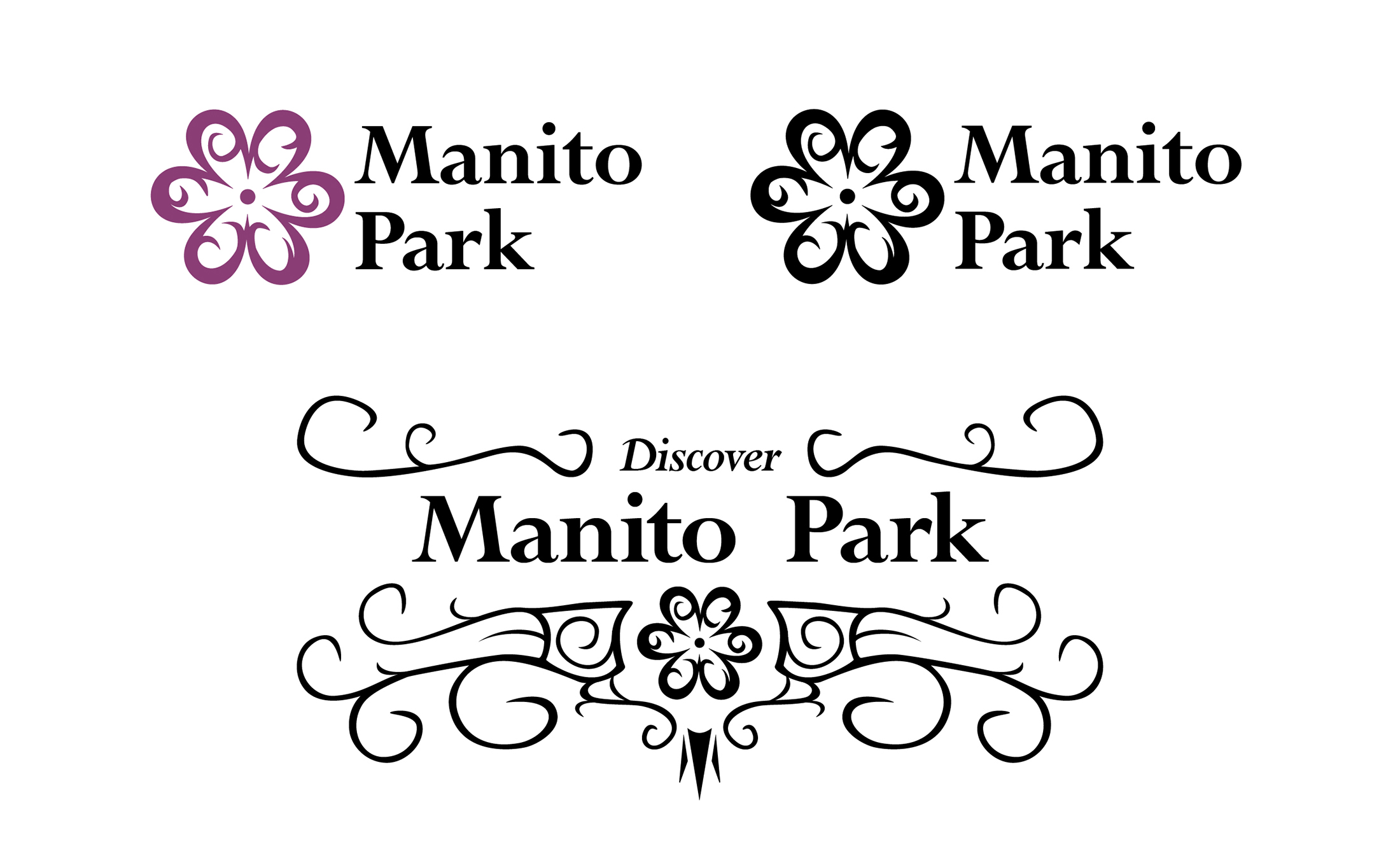
The logomarks
for the park were created to be stylistically consistent with each other and colorful. Elements from the logomarks were implemented into the destination poster. The main logo was designed with six “petals,” each one representing one of the main
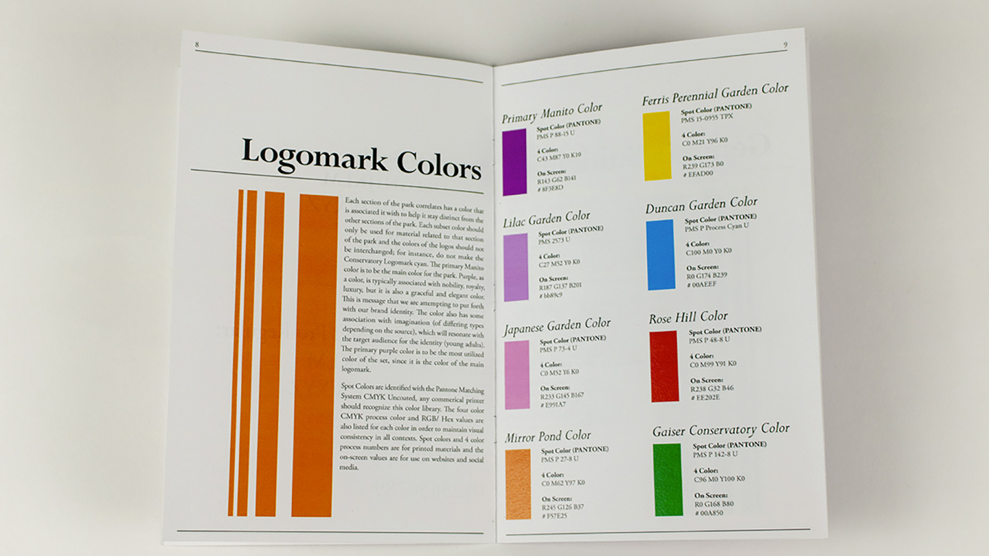
sections located around the park's office building. Each of these sections (referred to as subsets) has a its own logomark, each of which was designed to reflect the flora and fauna of the area it represents in some way. The visual identity
guide establishes guidelines for typography, brand voice, and the dos and don'ts for the logos.
extended process case study my role: production and visual identity.
Manito Park is one of the most renowned, recognizable, and historically important landmarks in the Spokane area, so why shouldn’t it have a strong visual identity? At the time I began this project Manito Park lacked a distinct and unique identity
for itself and its promotional materials, so I sought to remedy that issue. The park has significant historical value to the city of Spokane and a wide variety of visitors, ranging from locals to tourists from around the country. From the outset,
I made it my goal to communicate both the storied history of the park as well as the experience of visiting while it is in full bloom; these were going to be the biggest challenges. I believed that meeting these goals would create the most universally
appealing identity possible. With the knowledge that a new identity was going to need to be built from the ground up, I set out to gather as much information as I could about the park.
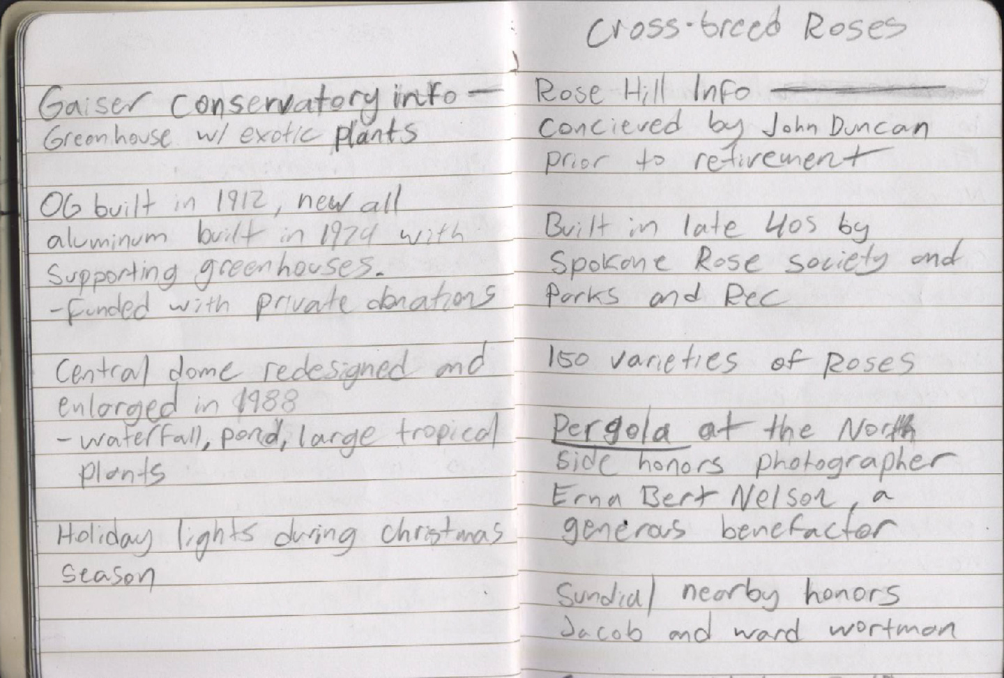
Excerpt of Notes
I visited the park several times, read all the plaques around the park, and took as many mental and physical notes as I could about the experience. I also scoured the internet for as much information as I could find on the history of the park. I observed
what other people were doing, what attractions people were most drawn to, and what kind of atmosphere the park had. I wanted to cement the mood and imagery of the park in my mind so that I could formulate a story and emotional palette to draw from.
I found myself repeatedly returning to the words “colorful, elegant, fragile, and expansive” during this process and knew that those terms were what I wanted to reference in my designs. During this research, I also realized that anyone who grew
up in the Spokane area was most likely intimately familiar with Manito Park. They had gone on dates there, had senior or professional photos taken there, or had visited at least once. Conversing with some of the people around the park reinforced
this observation, and so I decided that I was going to target an audience of newcomers; people like university students from other cities or tourists who weren’t familiar with what the park has to offer. Those who grew up in the area didn’t seem
like they needed a whole lot of convincing to walk around and smell the roses. I put together a set of reference images taken on my phone and got to work.
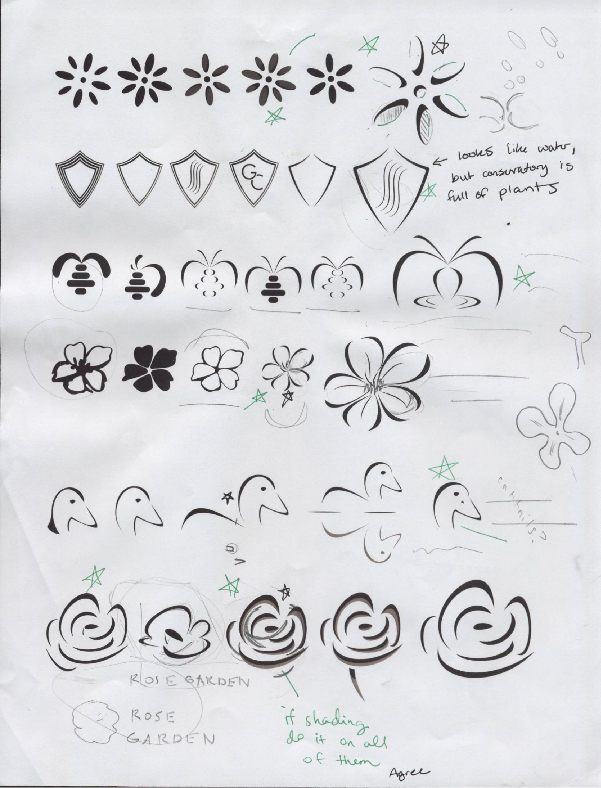
I set out a list of priorities: what did the park need and what order do things need to be built in? I decided that what I needed to focus on at first was the logo design, but not just for the park as a whole, but also each individual garden. These
subsections of the park are so distinct and memorable that I thought they, too, deserve an identity. I wanted each logomark to reflect either a plant or other distinctive feature of area it represented. For instance, creating a fountain symbol to
represent Duncan Garden's signature granite fountain. I based much of my selection on the set of photos I had gathered during my research. I got to work sketching and drafting these ideas, iterating on each of them numerous times before settling
on a “first set” that didn’t even include logomarks for the Joel E. Ferris Perennial Garden or the Lilac Garden. I had ideas for these logos but wanted to cement an overarching aesthetic before I continued working on them. I would go on to complete
these later, but for now I had some base designs to work with and iterate on. I made my own notes and sought out feedback on this work before moving on to develop them further.
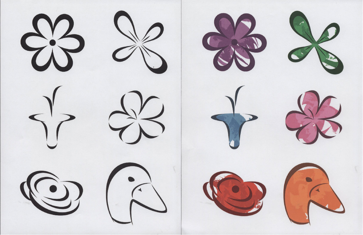
First logomark iterations feedback
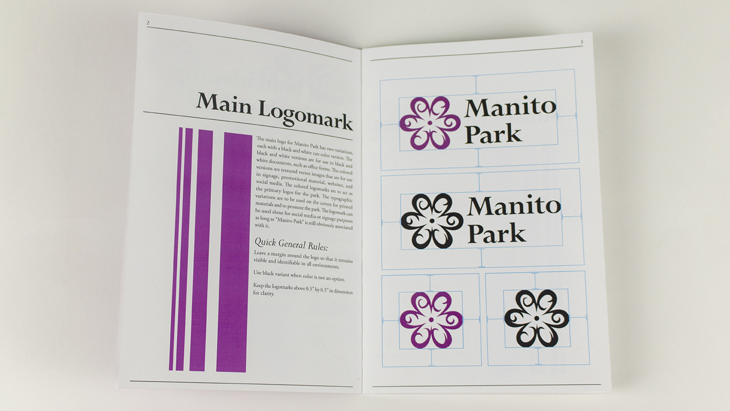
Two of my guiding words, elegance and fragility, were on display in these. I used the large, sweeping, high contrast strokes to help express these ideas. To reflect the historical aspect of the park, I set out to find an old-style typeface that could
reinforce these messages as well. This was challenging because many of the “old style” type faces that I thought embodied these ideas did not work well as display type. My first iteration of the primary logomark for Manito Park used the typeface
Bodoni MT, but its geometric design contrasted too much with my marks in a way that seemed to clash with my message rather than reinforce it. Finally, I settled on Perpetua, a typeface that is clean, simple, and smooth enough to synergize with my
logomarks.
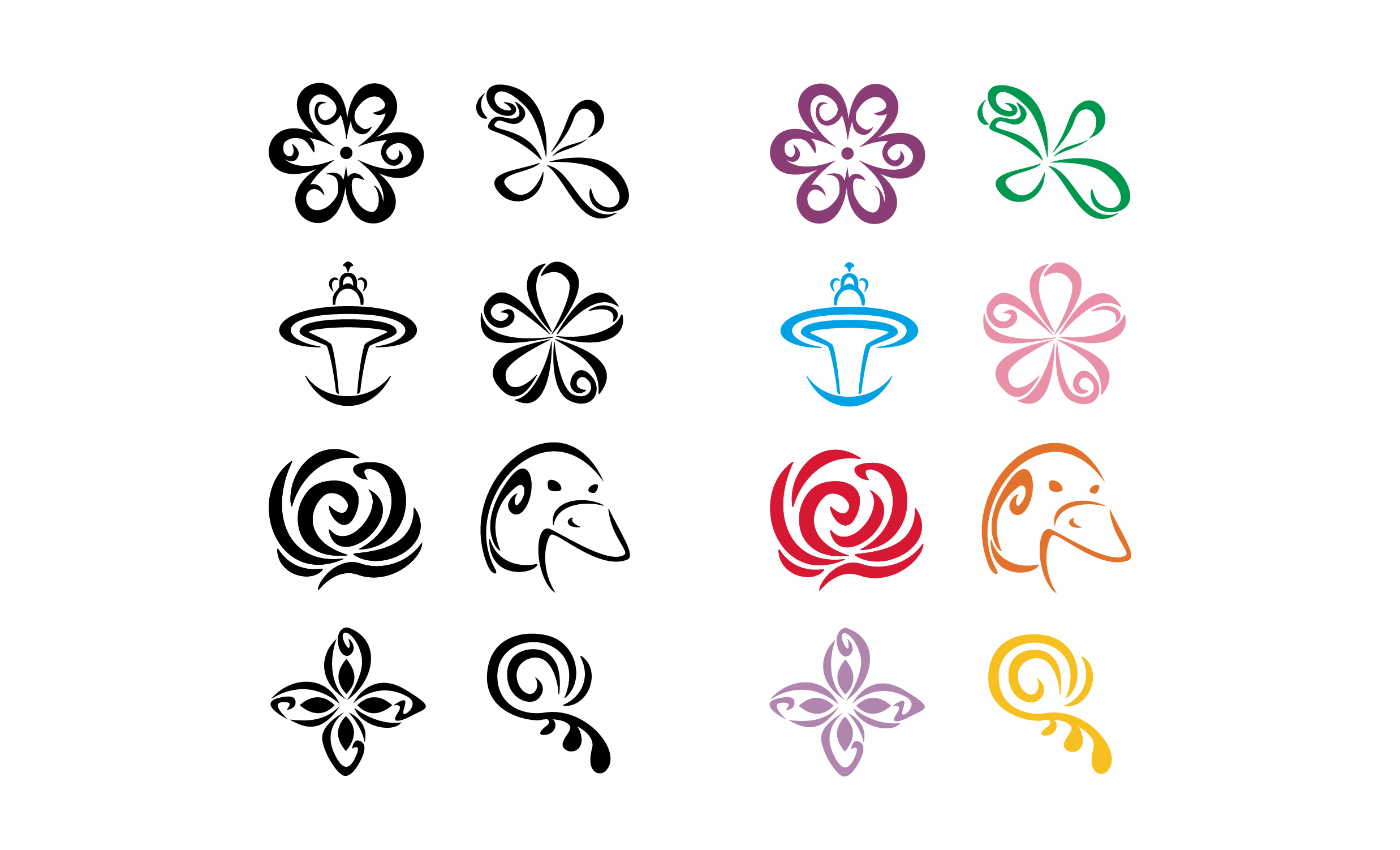
Second logomark iterations
"Final" Logomark Iterations
Typographic main logos and decorated header element
I then set out to create an identity standard guide through which I could create a design system that would match the logomarks and help me standardize future content. I created a small booklet for this purpose, which contains information about the
colors of each logo and how to use the typefaces that were chosen for the brand. It also details the “dos-and-don’ts” of the logomarks. I established a “brand voice” that future content was to follow and deeply considered what message all these
elements were sending when taken in together. With the guidelines set, I decided to move on to the next portion of the project: a destination poster.
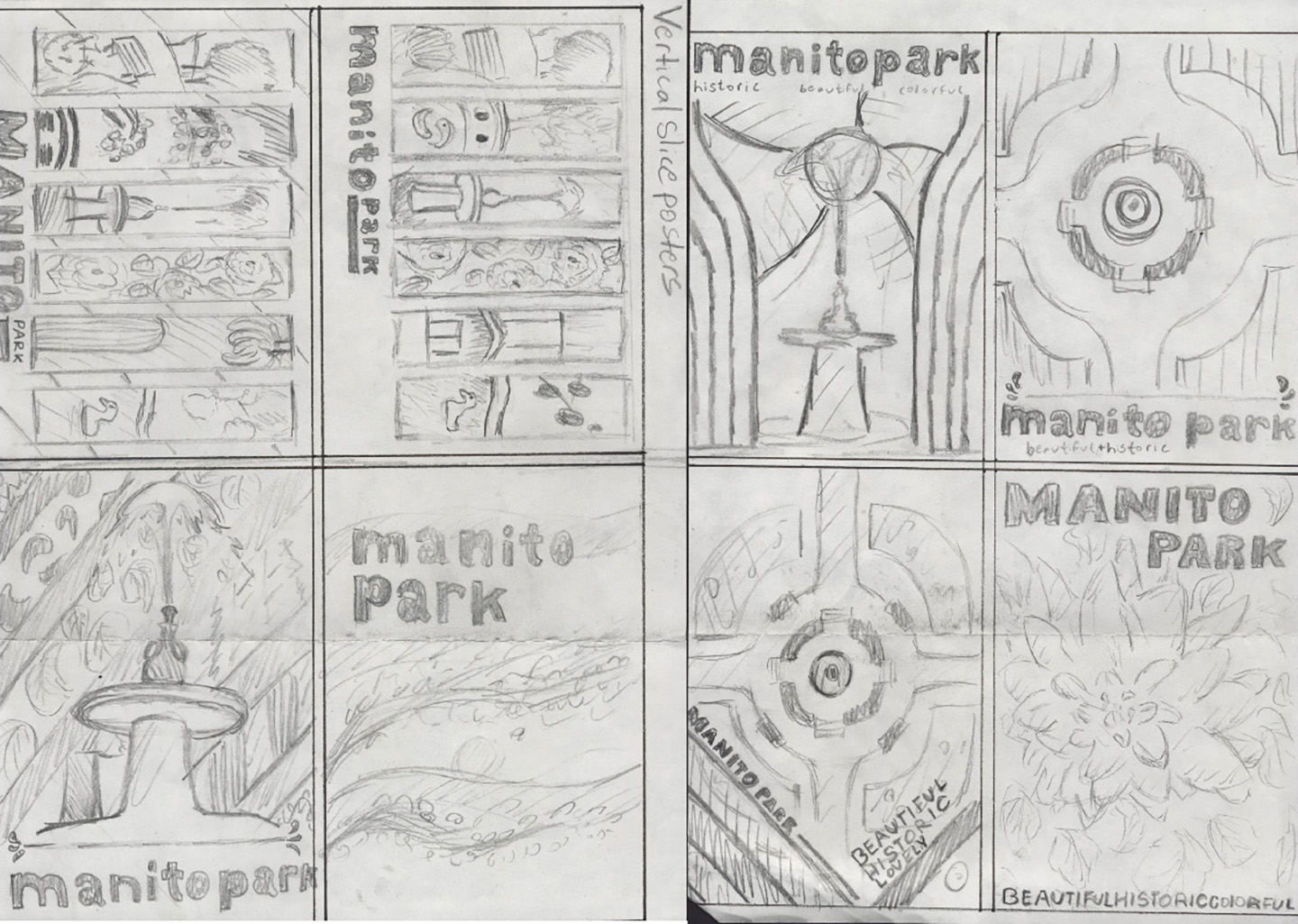
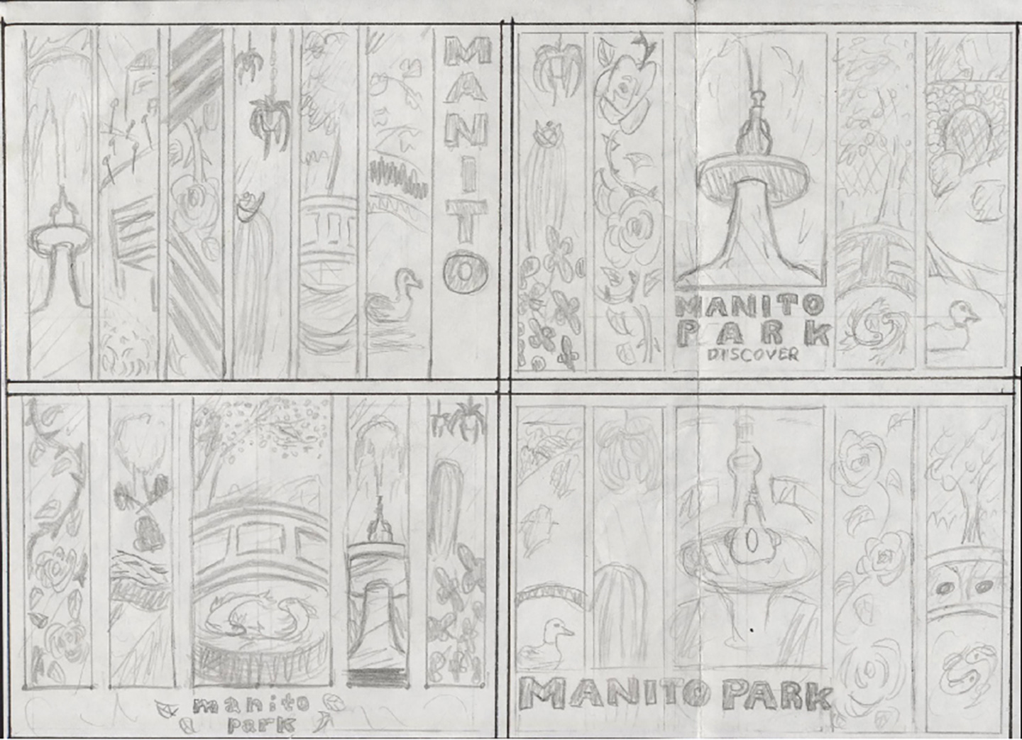
Poster Sketches
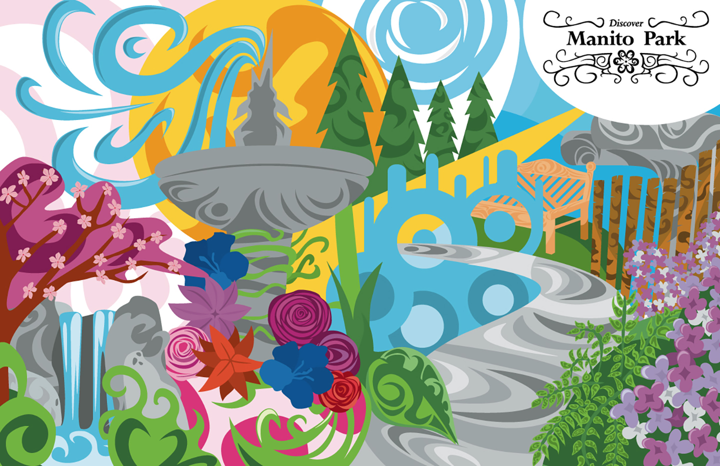
This poster would be for both print and web applications and would ideally provide a way for viewers to get a feeling for the park without going there; like giving potential visitors a teaser of the full experience. There was one major challenge that
I encountered when designing this poster: what do I show? The park is so massive that miniaturizing the experience into a single frame seemed like an unthinkable task. So, at first, I didn’t take that approach. Instead, I decided to try and “compress”
each of the major locations into a panel for the poster, sort of like a comic book. While my peers seemed to enjoy this approach and its “original” take on a destination poster, I wasn’t happy with my color choices and felt that the choice to break
things up into panels didn’t reflect the actual experience of Manito Park, where every set piece is connected seamlessly in one expansive collage of colors, textures, and history.
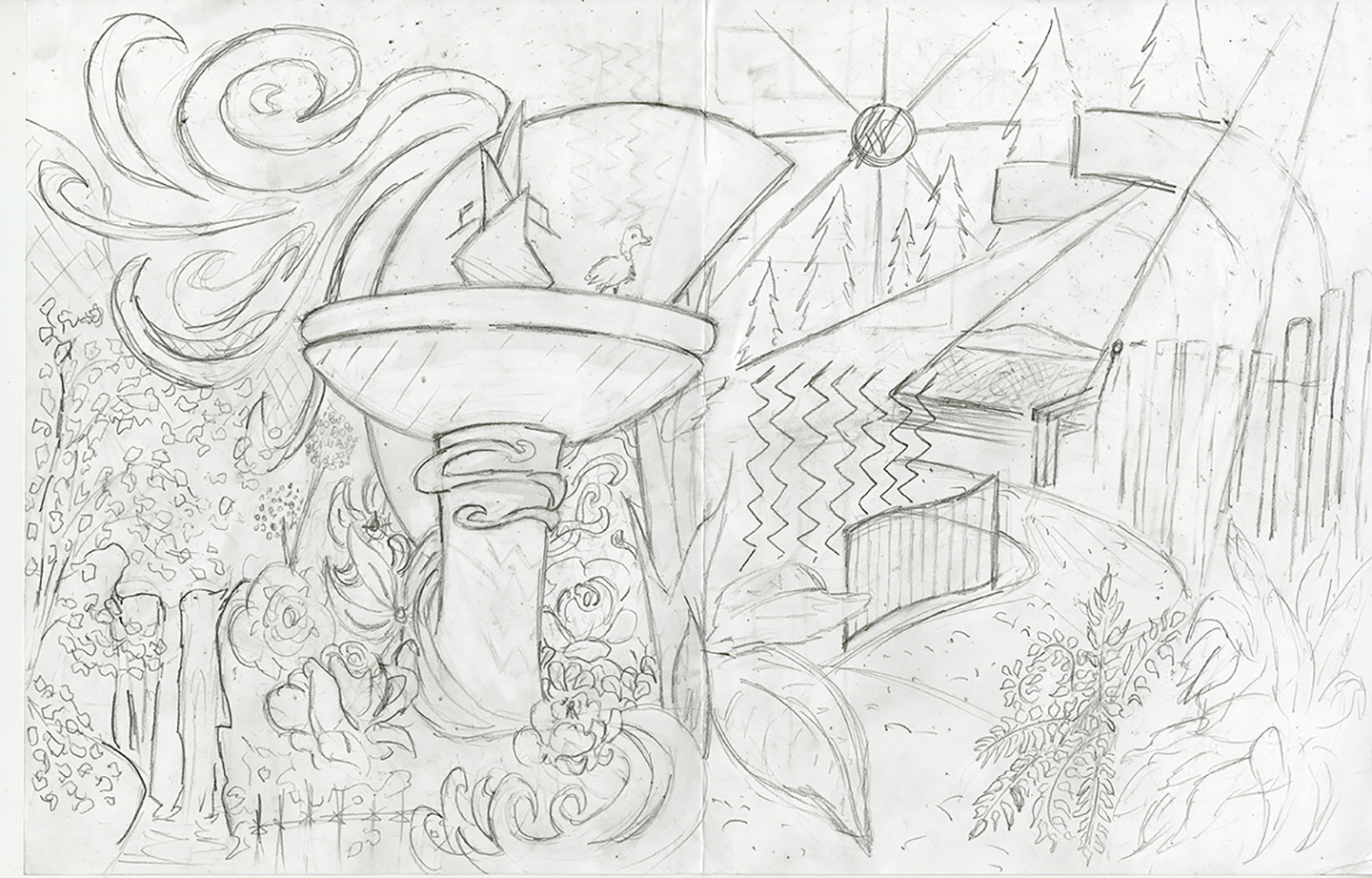
Reworked composition sketch
I took a step back to drawing board and thought about what I really thought I needed to show in this poster and what I wanted it to feel like. I decided to dedicate to the idea of an expansive feeling seamless image, in stark contrast to my first
digital sketch, because the park doesn’t feel segmented when you’re exploring it. This led to a sketch that had a more expansive and sweeping feeling where I incorporated several elements from different parts of the park in a more abstract fashion.
I found that this composition better represented my overall goals and fit with my existing identity much better. When I began to illustrate it digitally, I incorporated the same sweeping strokes into the illustration that I used for the logomarks.
This helped add another layer of visual cohesion to the project. In addition, I wanted to create a more visually stimulating typographic symbol for the park to use on the poster, so I created one that incorporated intricate linework and the park’s
new main flower logomark.
Digital Manito Park destination poster
I presented and sold this poster at several events, some related to school and some independently, and was happy to hear that many people said that the poster accurately reflected the overall mood of the park. I remember one lady loving it so much
that she bought two, one for herself and one for a friend that lived a few blocks away from the park. I think it was beneficial to keep the goals I set in mind and stick to them when developing the second iteration of the destination poster. Once
the poster was complete, I copied it into a second file and created a version for screens and a version for print, making slight color adjustments on each as needed.
I learned a lot in this project about designing logomarks and identities, including some things that I feel like I need to expand my knowledge on such as developing a brand voice. I developed my illustration skills quite a bit over the course of this
project, and in the end, I came out with a product that I can take pride in. Eventually, I went on to expand this project even further with a new website for Manito Park. I believe that this project met the goals that I set at the start by helping
create a set of more unified visuals for Manito Park that accurately reflects the experience of visiting the location. To see more on this project and how I incorporated my visual identity into a website, you can view the website’s page here. This is one of my most expansive projects, incorporating and pushing most of my design skills. I found iteration and repeated personal and external critique to be my most valuable resource during development. It was a matter of refining my ideas
over and over before I was able to fully develop my vision for what Manito Park should be represented by.
Thanks for reading. Now that you're done, why not go to Manito Park?