project insights
my role: web designer
The sidenav of the Local Deli's menu page..

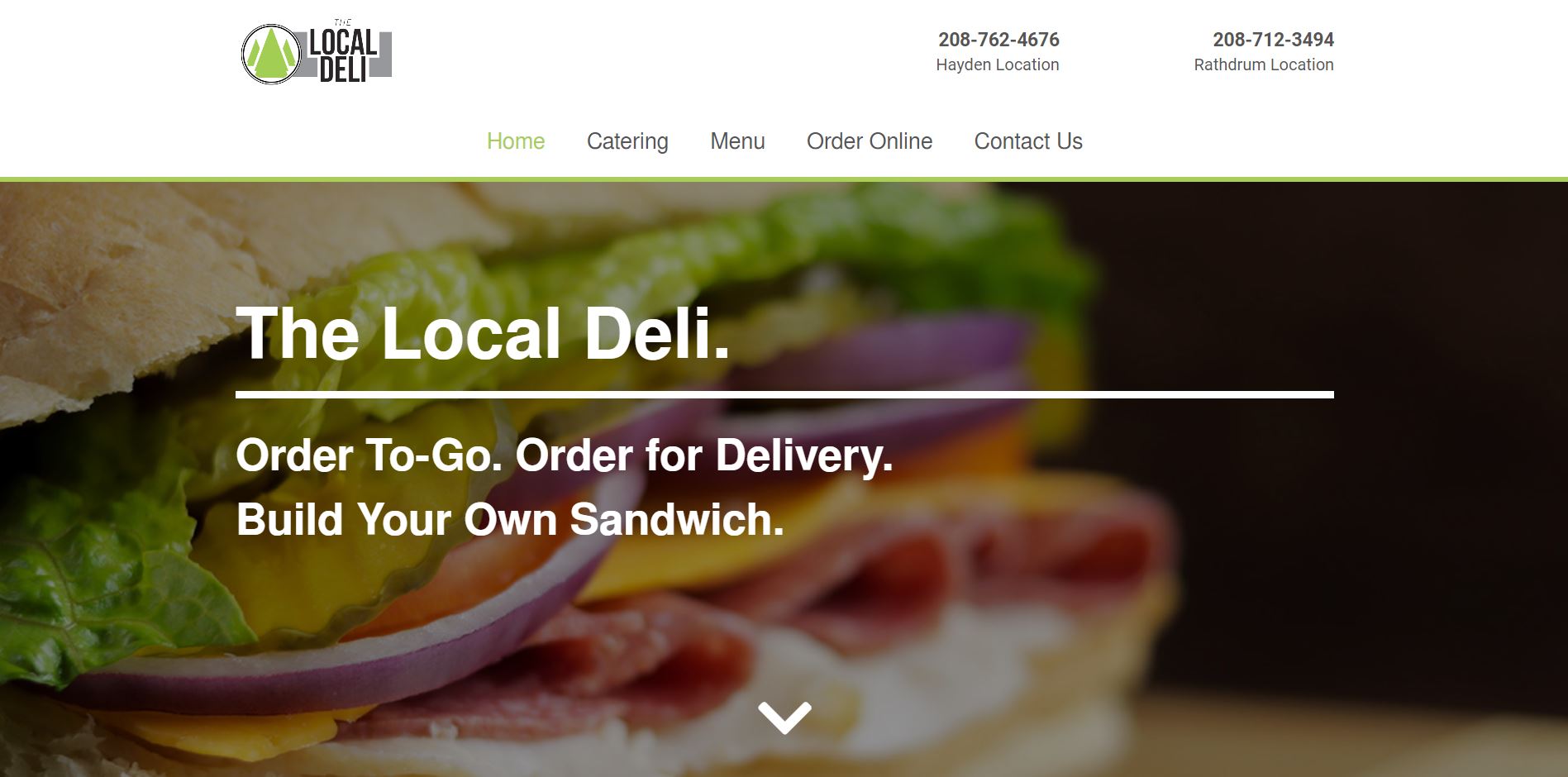
Local Deli Rathdrum's old appearance.

I used this project as a way to experiment with more in-page animations. Because the website consistents of relatively simple information, there needed to be some extra visual elements to keep visitors engaged. The primary use of the website for most visitors is to check the menu or catering options- which means I gave those pages the most attention. The primary feature of the menu page is the sidebar navigation that allows users to scroll up and down the page easily. It also displays what section the user is currently viewing if the subheaders of the page happen to scroll out of sight.

The sidenav of the Local Deli's menu page..

Menu Page Side Navigation.

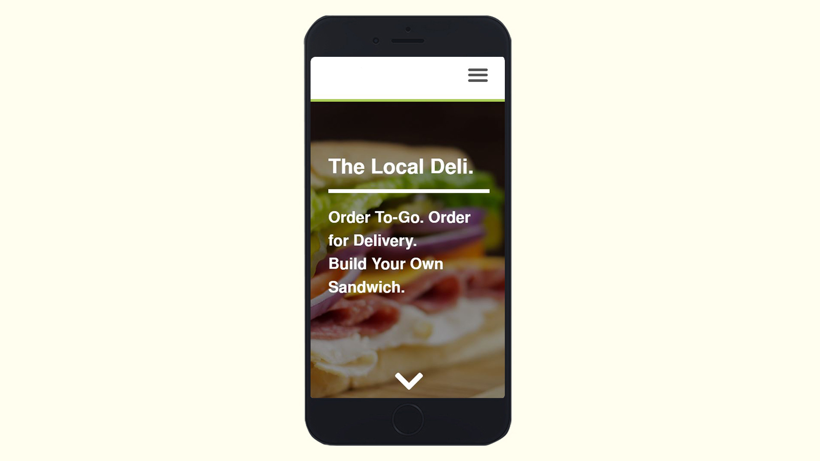
This feature was not able to be implemented on mobile devices and if I were to attempt the project again I would have worked to find a solution for this issue. Organizing the content was quite the challenge simply because there was no previous frame of reference for the page on the old sites. The old website's menus were simply an elongated .png scan of their paper to-go menus. The page is organized in a three column grid with the entire left column being dedicated to images. Some of these images are then hidden from view as the resolution gets smaller in order to make more effective use of the limited screen space on mobile devices.

Thanks for reading.

— Justice / justicedsn@gmail.com