-
-

-
project objective
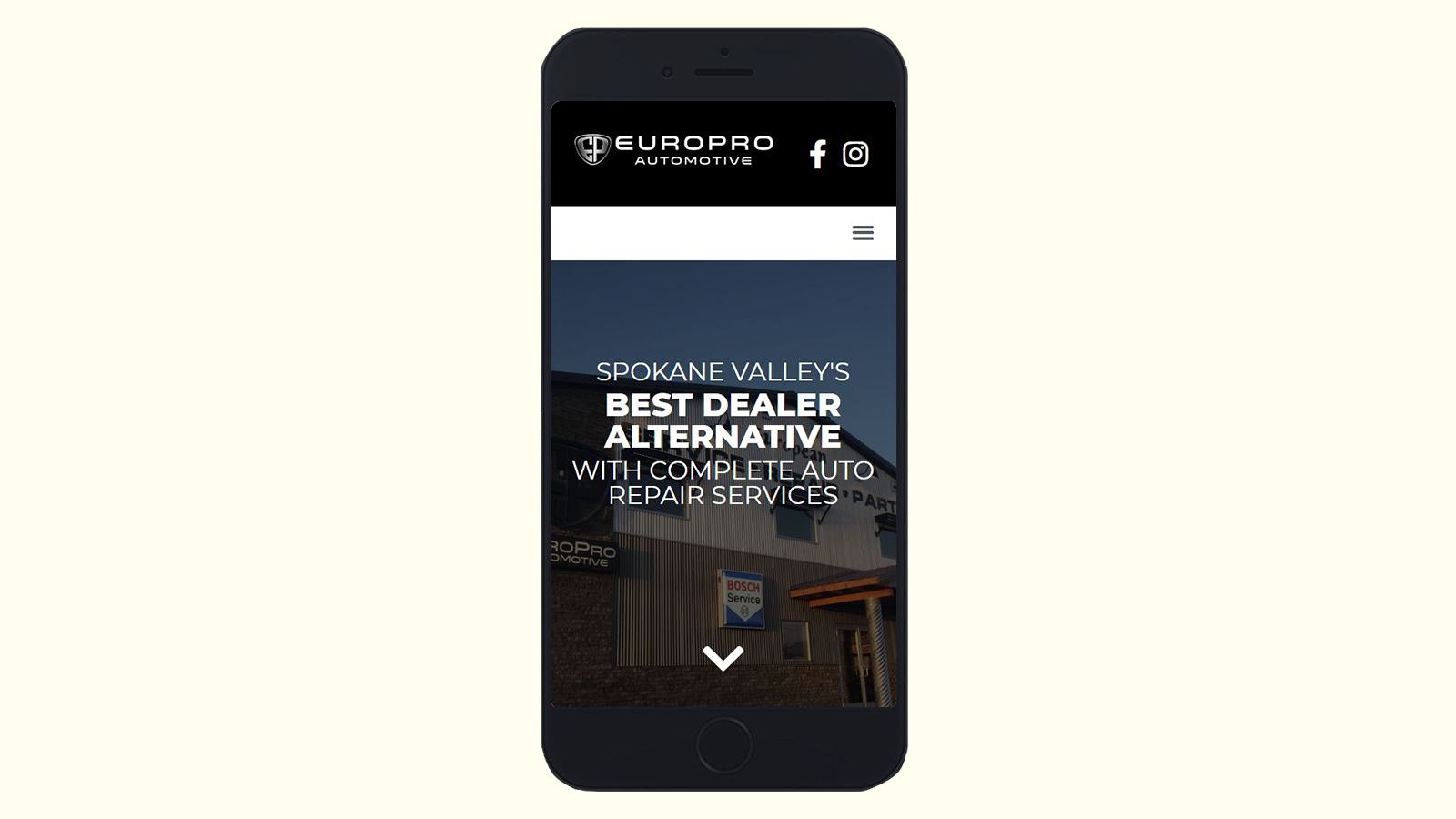
Update EuroPro's website to match their new, more refined visual identity.
target audience
European car enthusiasts and those who are simply looking for a repair shop in Spokane. EuroPro also sells vehicles, however this took a backseat on this project.
-
audience needs
This website is a relatively one primarily intended to present business information, meaning the most important goal was to ensure that it is accessible on all kinds of devices.
deliverables
A responsive website that utilizes up-to-date photography and content.